I created a real-time presence system for Meta.
When I login into facebook, I want to feel like my friends are their with me across the app.
Bringing Co-Presence to Life within Facebook Groups
Let me start by setting the stage.
This journey was filled with challenges, insights, and a lot of creativity, and I’m thrilled to take you through it.
Facebook Groups are a core part of our platform, fostering communities around shared interests and connecting people worldwide. However, I noticed that while people were engaging in groups, there was a gap in real-time interaction. I wanted to enhance the sense of community by making it possible for members to interact in real-time within groups, leading me to the idea of Co-Presence.
Ideation of Concepts
With the need identified, I moved on to the conceptualization phase. I held brainstorming sessions with cross-functional teams, including product managers, engineers, and UX researchers. Our goal was to create a feature that allowed group members to see and interact with each other in real-time.
I came up with several ideas, such as creating bridges to the metaverse, live video rooms, interactive emoji’s, and virtual hangouts. After evaluating the feasibility and user impact of each idea, I decided to focus on a feature that allowed group members to see who was online and engage in live events or video sessions directly from key surfaces.
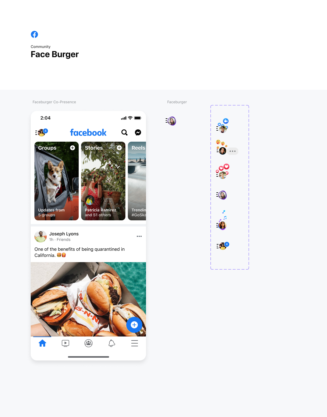
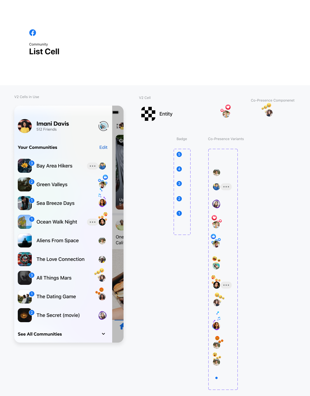
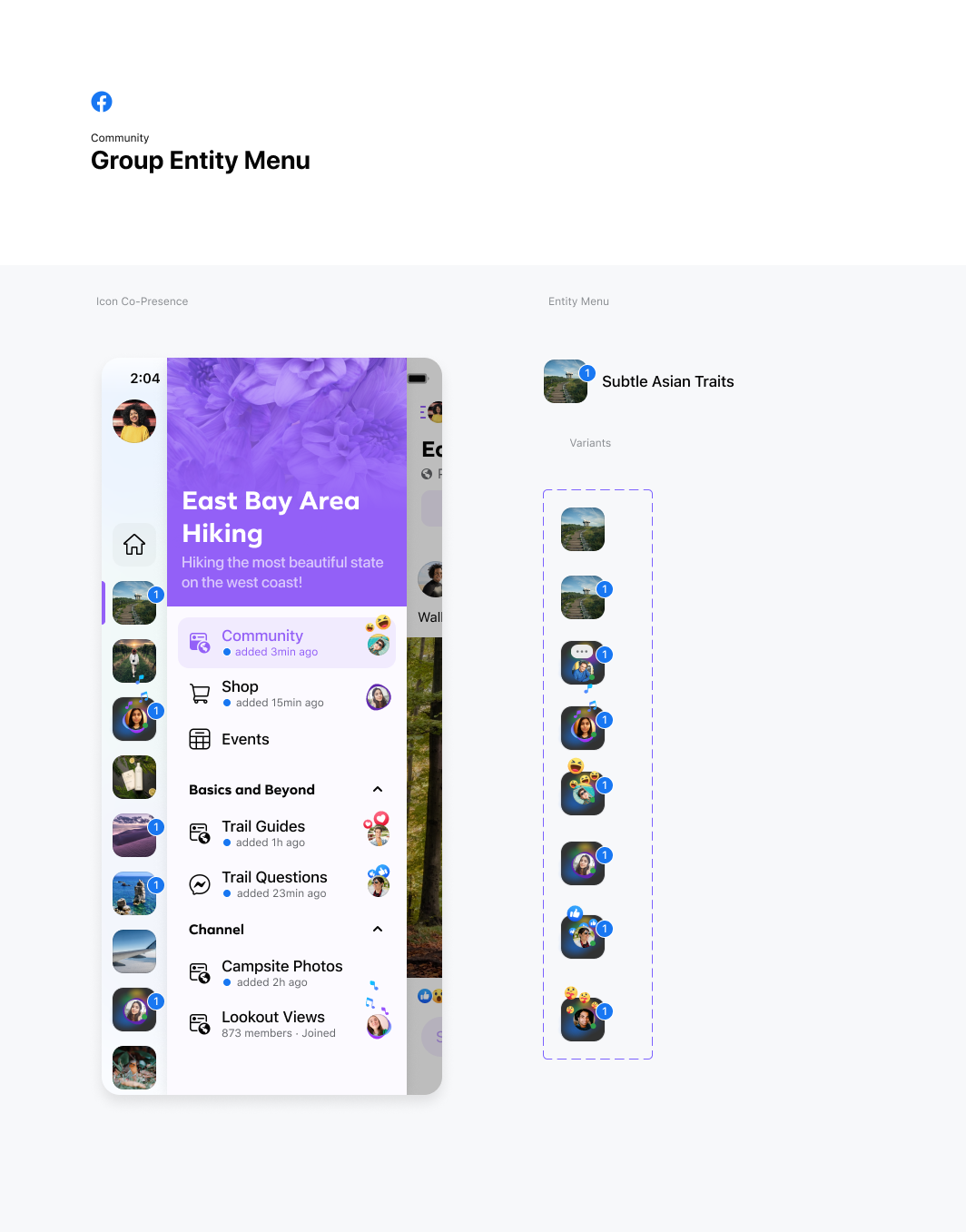
Design Principles
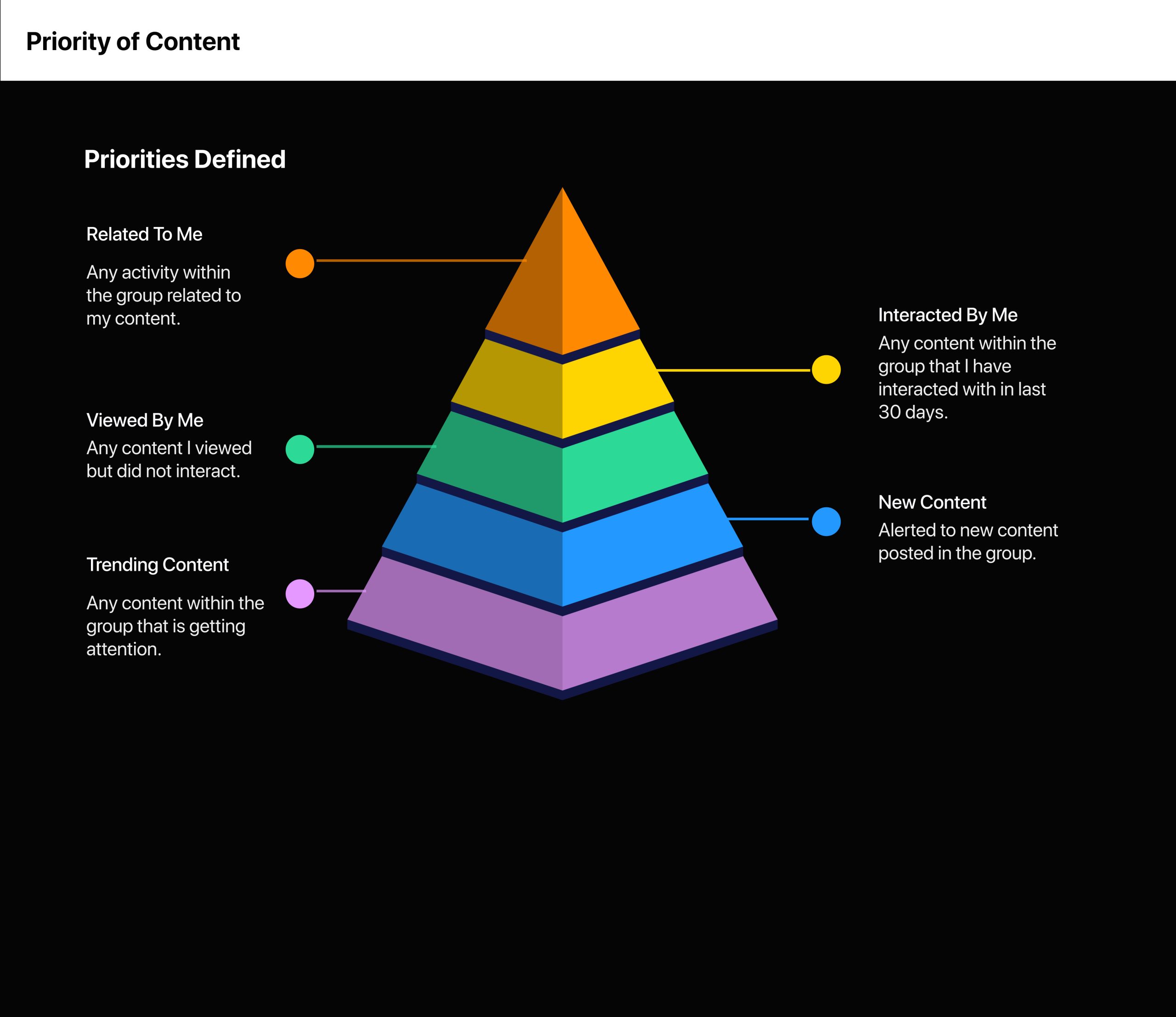
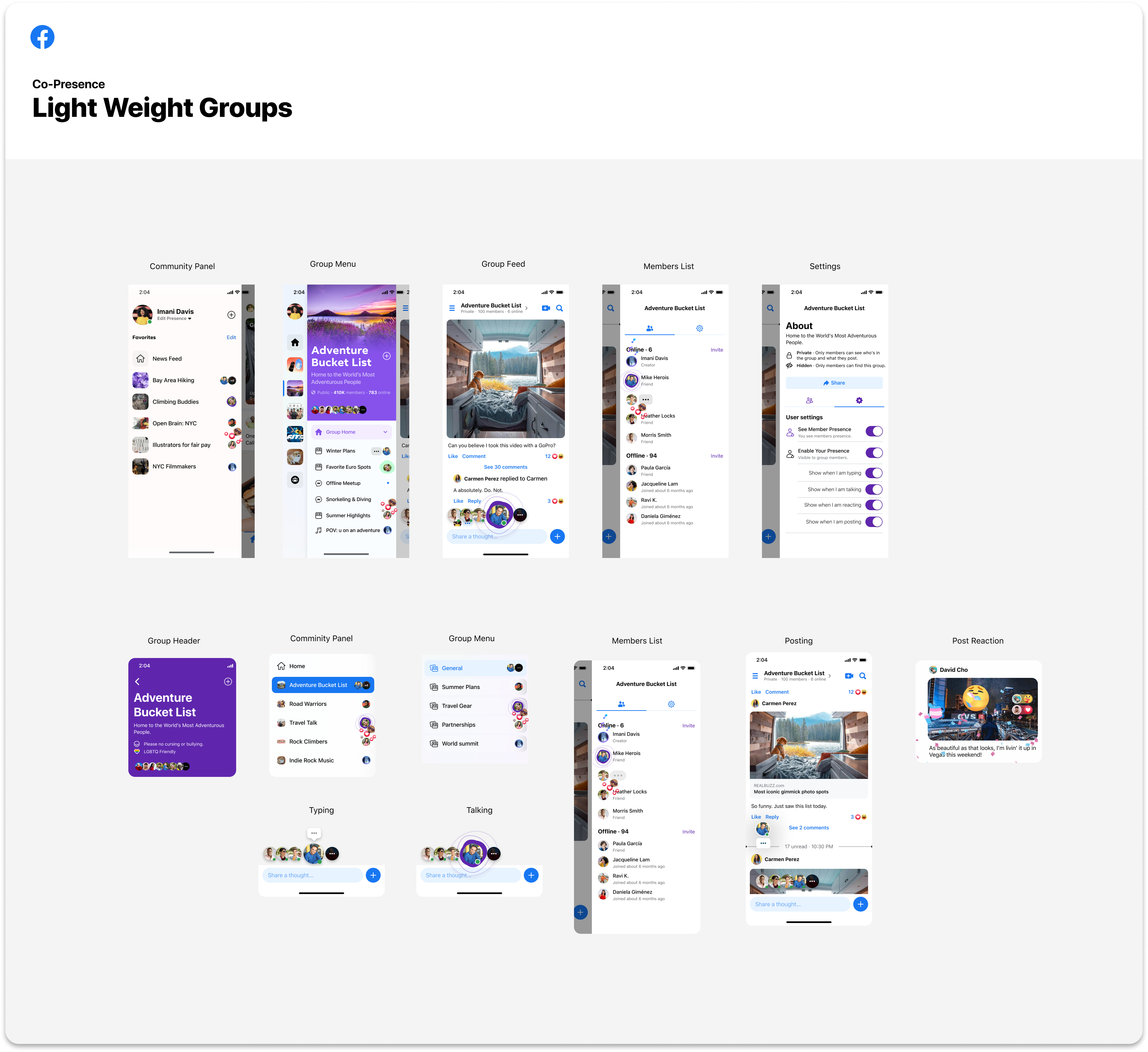
I defined a set of rules to govern how much Co-group activity we show the user at one time across the Common surfaces.
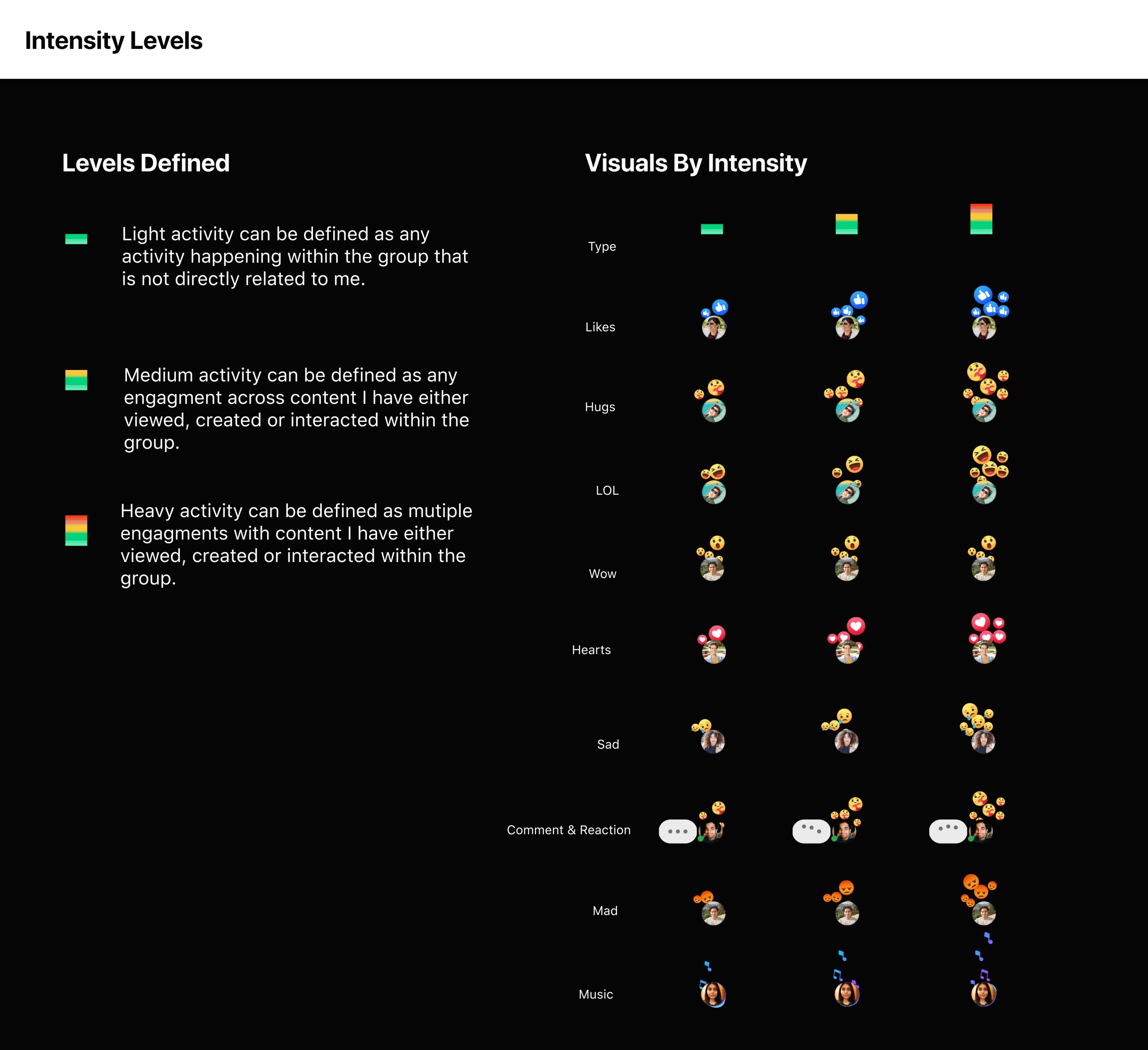
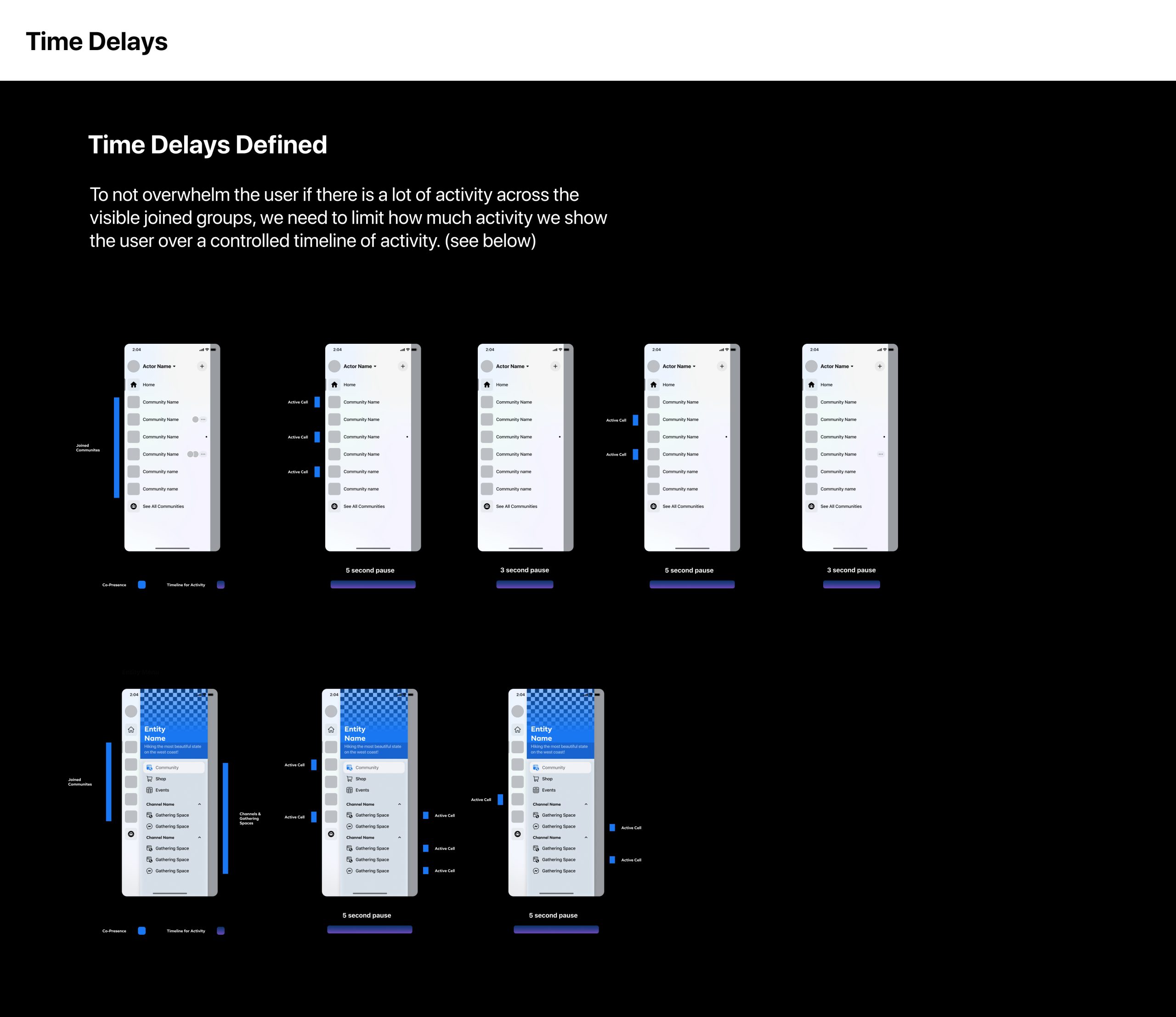
Design and Prototyping
The design phase was both exciting and challenging. I wanted the Co-Presence feature to be seamless, intuitive, and integrated smoothly into the existing Groups interface. I created wireframes and interactive prototypes, iterating on feedback from internal stakeholders and usability testing sessions.
One of the key design principles was to ensure that the feature did not overwhelm users but enhanced their experience. We designed subtle yet effective visual cues to indicate online members and made it easy for users to start live interactions.
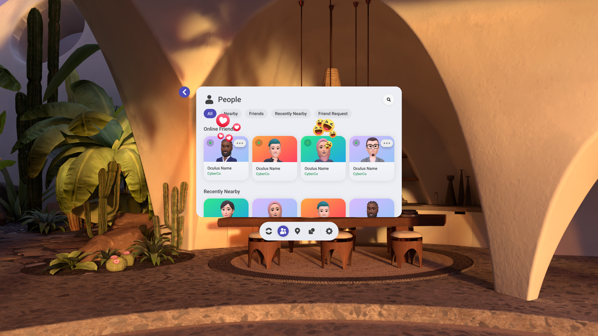
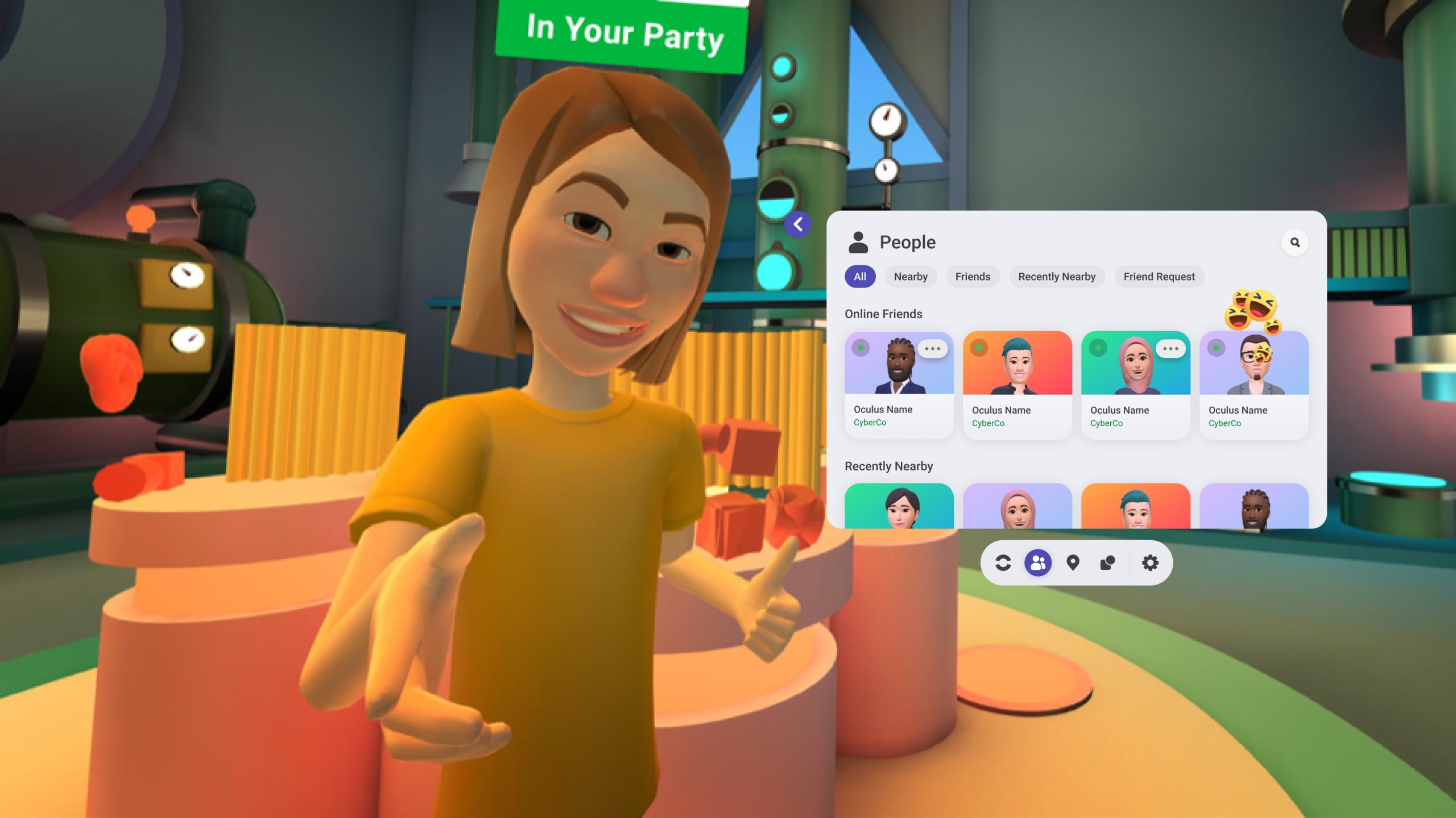
Development and Testing
Once the design was finalized, I collaborated closely with the engineering team to bring the feature to life. This phase involved regular sync-ups, code reviews, and continuous testing. I adopted an agile approach, allowing us to iterate quickly based on feedback and ensure that the feature was robust and scalable.
I also conducted extensive beta testing with a select group of users. Their feedback was invaluable in refining the feature and addressing any usability issues.
Launch and Impact
After months of hard work, I was ready to launch Co-Presence. I rolled it out gradually, monitoring user engagement and feedback closely. The response was overwhelmingly positive. Group members loved the ability to interact in real-time, and we saw a significant increase in group activity and engagement.
The Co-Presence feature not only enhanced the sense of community within groups but also opened up new possibilities for how people connect and interact on Facebook.
Conclusion
Bringing the Co-Presence feature to life was a rewarding journey that showcased the power of collaboration, user-centric design, and iterative development. It reinforced the importance of understanding user needs and being willing to innovate to meet those needs.
Thank you for your attention, and I’m happy to answer any questions you may have about the Co-Presence feature or the design process.
Product Design
Reach out to discuss your project or role 👍😎🧐
I always enjoying hearing about new opportunities, so please drop me a line and say hello.